
20+ Viral Nursery Paint Colors That Transform Baby Rooms (2026 Trending Guide)
Choosing the perfect nursery paint color can feel overwhelming with endless options available. Whether you’re designing a calming sanctuary for your newborn or creating a playful space that will grow with your child, the right wall color sets the foundation for the entire room.
This comprehensive guide features over 20 trending nursery paint colors that have taken social media by storm. From soothing neutrals to bold statement shades, these carefully curated colors will help you create a beautiful, Instagram-worthy nursery your family will love for years to come.
Why Nursery Paint Color Matters
The paint color you choose for your baby’s nursery does more than just look pretty. Color psychology suggests that certain hues can influence mood and behavior. Soft, muted tones typically promote calmness and relaxation, while brighter shades can stimulate creativity and playfulness as your child grows.
Additionally, the right paint color can make a small nursery feel more spacious, enhance natural lighting, or create a cozy, intimate atmosphere depending on your goals.
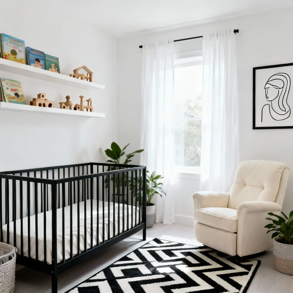
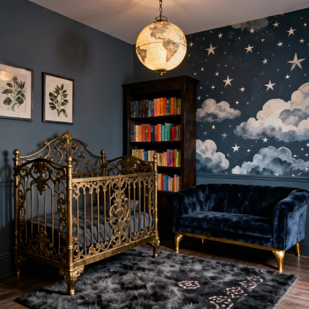
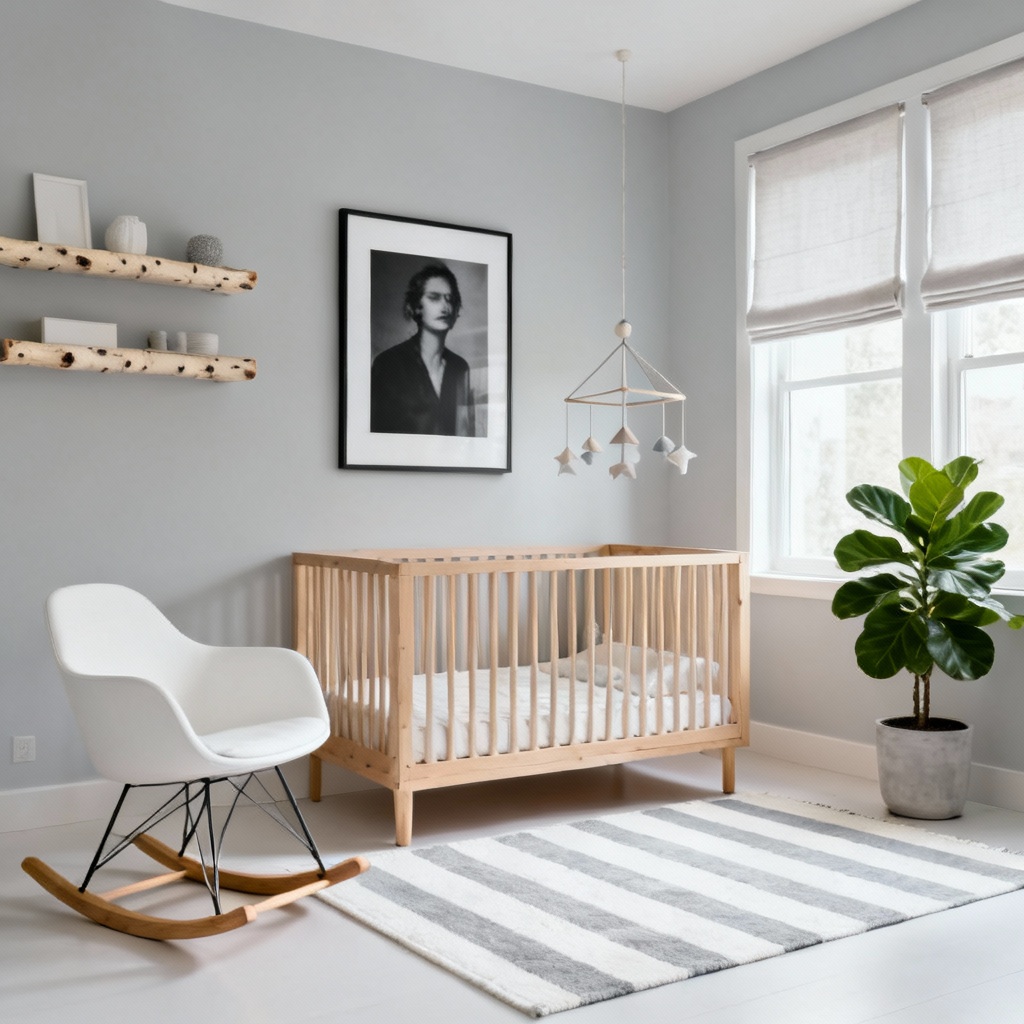
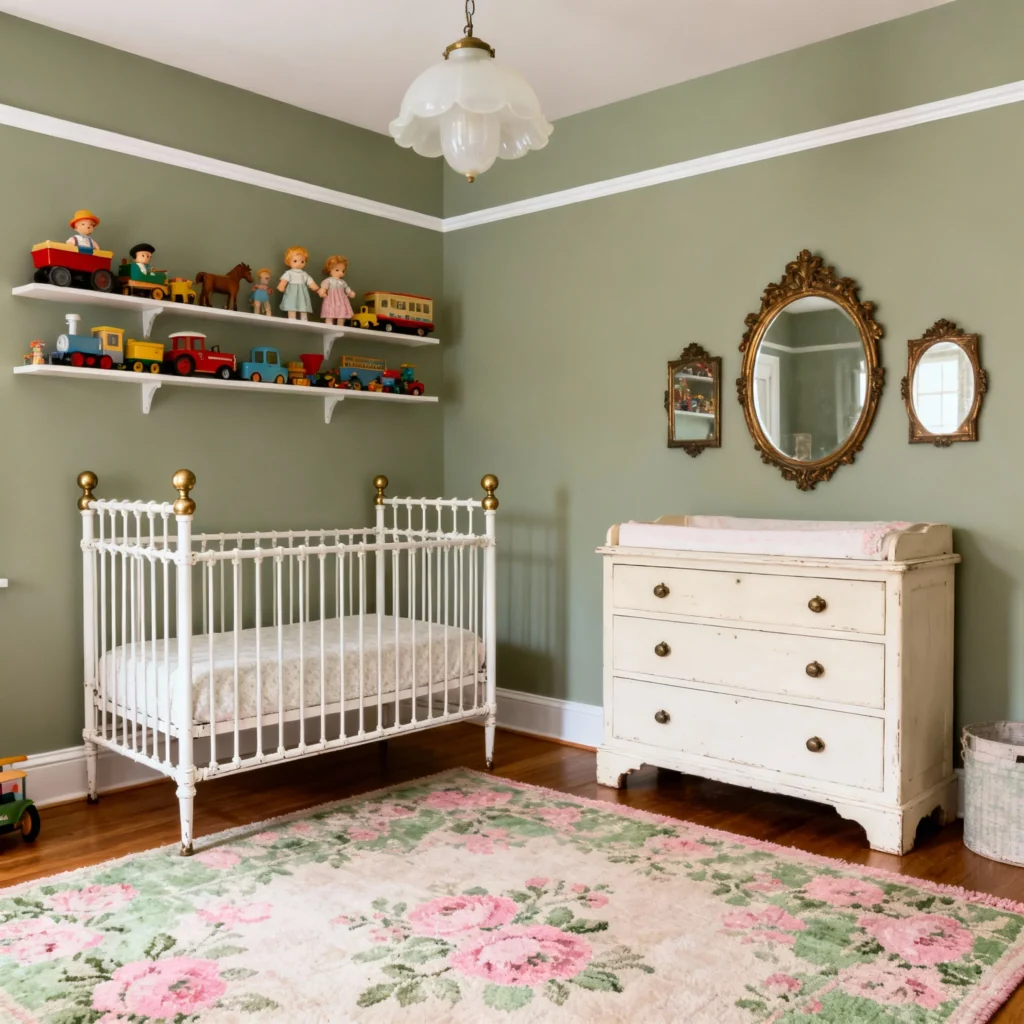
Timeless Neutral Nursery Paint Colors
Neutral paint colors remain the most popular choice for nurseries, offering versatility and longevity. These shades work beautifully with any decor style and make it easy to update accessories as your child’s tastes evolve.
1. Benjamin Moore White Dove (OC-17)
One of the most beloved white paints in the design world, White Dove offers a soft, warm white that never feels stark or cold. This versatile shade provides a clean backdrop that allows your nursery furniture and decor to shine while maintaining a serene atmosphere. It works exceptionally well in rooms with abundant natural light and pairs beautifully with both warm and cool accent colors.
Best for: Traditional, modern, and minimalist nurseries
2. Benjamin Moore Revere Pewter (HC-172)
This greige (gray-beige hybrid) has earned cult status among interior designers for good reason. Revere Pewter brings warmth without being too beige and coolness without feeling too gray. The color adapts beautifully to different lighting conditions, making it an foolproof choice for any nursery orientation.
Best for: Transitional and contemporary spaces
3. Sherwin Williams Accessible Beige (SW 7036)
A true beige with slight taupe undertones, Accessible Beige creates a warm, welcoming environment perfect for a nursery. This color has enough depth to feel intentional without overwhelming the space, and it coordinates effortlessly with wood tones and metallic finishes.
Best for: Warm, cozy nurseries with traditional or farmhouse aesthetics
4. Benjamin Moore Natural Cream (2154-60)
This creamy greige brings instant warmth to any nursery. Natural Cream works particularly well with brass fixtures, natural wood furniture, and linen textiles. The subtle warmth creates an inviting space that feels both sophisticated and baby-friendly.
Best for: Bohemian, organic modern, and eclectic nurseries
5. Farrow & Ball Lamp Room Gray (88)
Despite its name, this is a rich, medium-toned gray with cool blue undertones that creates depth and sophistication. Lamp Room Gray is darker than typical nursery neutrals, making it perfect for those seeking a moody, dramatic aesthetic without sacrificing the calming qualities needed in a baby’s room.
Best for: Modern, sophisticated, and gender-neutral nurseries
6. Sherwin Williams On the Rocks (SW 7671)
This light, cool-toned gray brightens any space and creates an airy feel. On the Rocks has just enough warmth to prevent it from feeling too sterile while maintaining a fresh, clean aesthetic. It’s particularly stunning when paired with white trim and natural wood accents.
Best for: Scandinavian, minimalist, and bright, airy spaces
7. Farrow & Ball French Gray (18)
A unique shade that hovers between gray and green, French Gray shifts throughout the day with changing natural light. This handcrafted paint brings subtle complexity to a nursery, offering visual interest without being overwhelming. The gentle green undertones connect the space to nature.
Best for: Vintage, transitional, and nature-inspired nurseries
8. Dulux Beige Royal
This classic, elegant beige delivers warmth and sophistication in equal measure. Beige Royal works beautifully at full strength or diluted to half strength for an even softer effect. It’s particularly stunning when used with board and batten or wainscoting treatments.
Best for: Classic, traditional, and elegant nursery designs
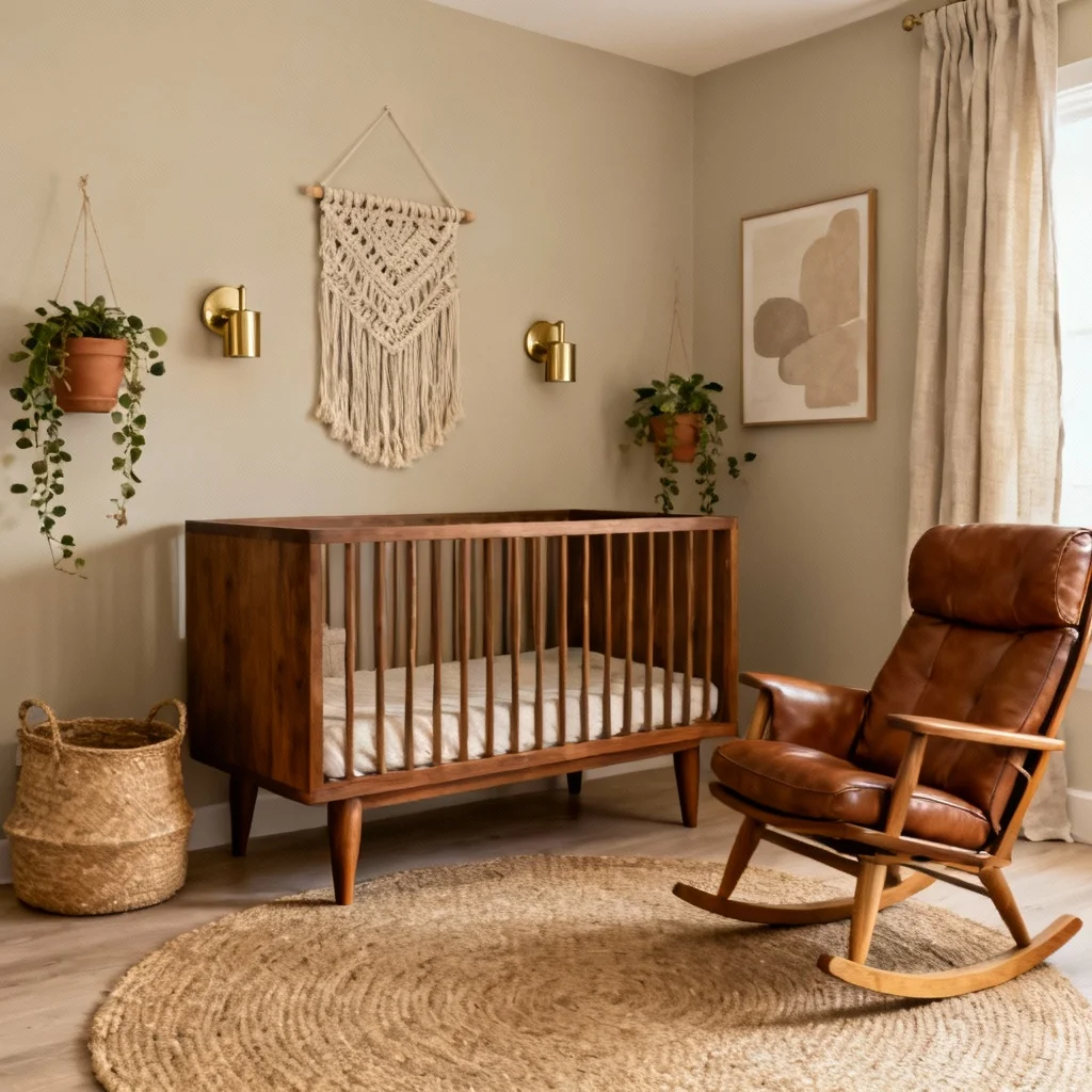
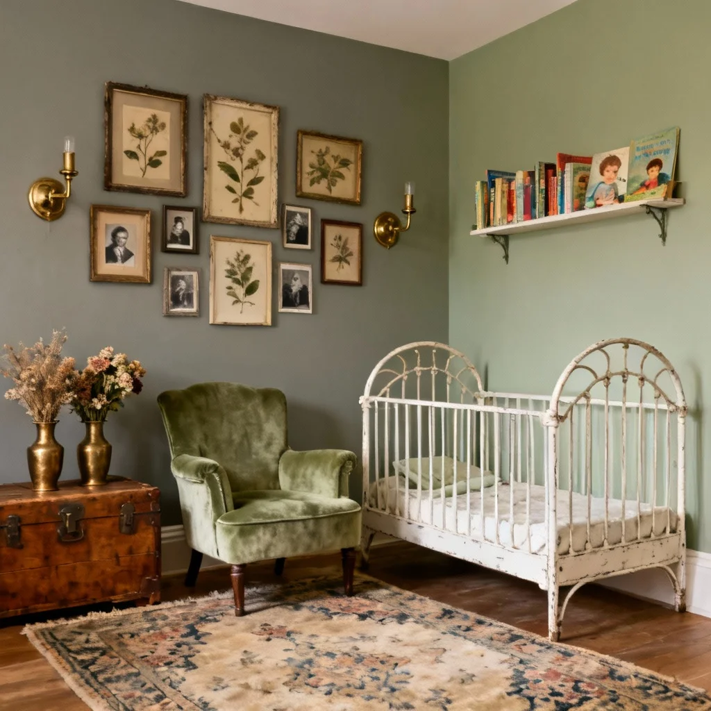
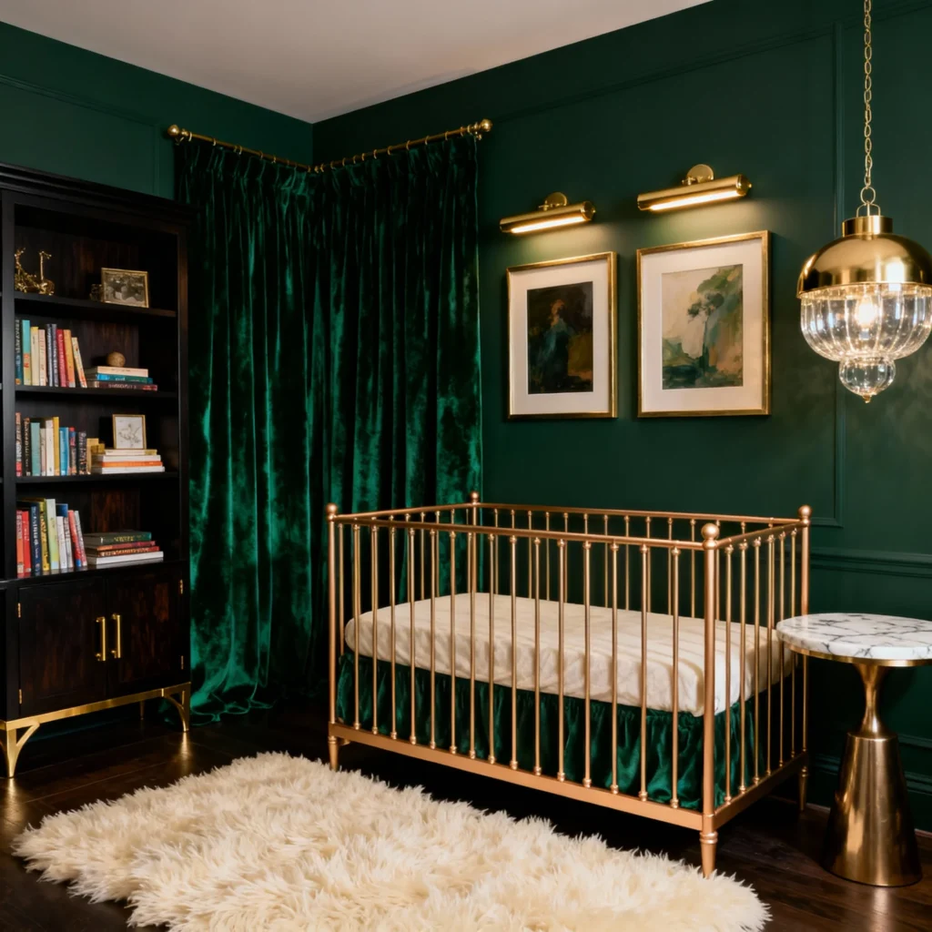
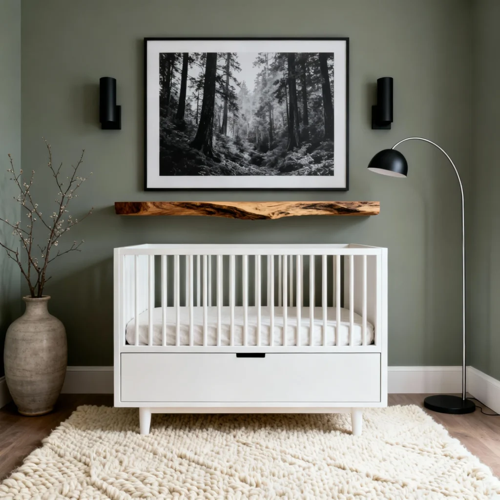
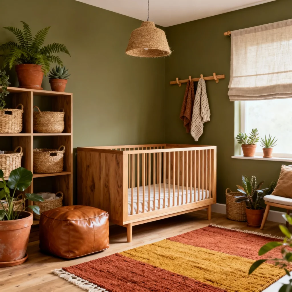
Trending Green Nursery Paint Colors
Green has emerged as one of the hottest nursery paint colors in recent years. These nature-inspired hues bring the outdoors in, creating peaceful, grounding environments perfect for rest and growth.
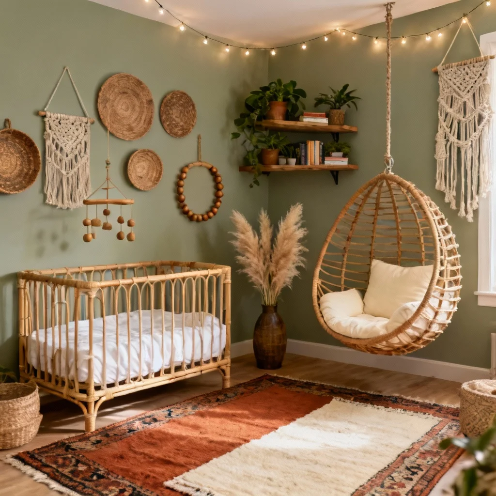
9. Sherwin Williams Clary Sage (SW 6178)
This muted sage green offers the perfect balance of color and neutrality. Clary Sage has earthy undertones that create a sophisticated, calming environment. It pairs beautifully with natural materials like rattan, linen, and wood, making it ideal for bohemian or organic modern nurseries.
Best for: Boho, cottagecore, and nature-themed nurseries
10. Farrow & Ball Pigeon (25)
A cool-toned green with strong blue undertones, Pigeon is one of the most versatile green paints available. This color shifts beautifully throughout the day, appearing lighter and softer in bright sun and deeper and moodier in low light. The complexity adds visual interest without overwhelming the space.
Best for: Vintage, traditional, and woodland-themed nurseries
11. Benjamin Moore Saybrook Sage (HC-114)
This soft, gray-green brings instant tranquility to any nursery. Saybrook Sage is gentle enough for a baby’s room while having enough character to create a designed look. The color works exceptionally well with white furniture and natural textiles.
Best for: Transitional, farmhouse, and coastal nurseries
12. Sherwin Williams Halycon Green (SW 6213)
A more vibrant option, Halcyon Green makes a bold statement while maintaining a soothing quality. This distinctive shade works beautifully as an accent wall behind the crib or throughout the entire room for those wanting a more dramatic look. The color has depth that photographs beautifully.
Best for: Statement walls, modern nurseries, and bold design lovers
13. Behr Halls of Ivy (N400-7)
For those seeking a richer, darker green, Halls of Ivy delivers with its deep, sophisticated tone. This one-coat coverage paint has cool undertones that create a cocooning, restful environment. Despite being darker, it maintains the calming qualities essential for a nursery.
Best for: Moody, dramatic, and sophisticated spaces
14. Farrow & Ball Treron (292)
A soft, dusty green that pairs beautifully with both pink and blue accents, making it perfect for gender-neutral nurseries. Treron has a vintage quality that works wonderfully with white trim and classic furniture pieces. The subtle complexity of this shade ensures it never feels flat.
Best for: Gender-neutral, vintage, and classic nurseries
15. Sherwin Williams Evergreen Fog (SW 9130)
Sherwin Williams’ 2022 Color of the Year remains a top choice for nurseries. This sophisticated gray-green brings serenity and style in equal measure. Evergreen Fog creates a grounding environment that feels both contemporary and timeless.
Best for: Modern, sophisticated, and nature-inspired spaces
16. PPG Dark Sage (PPG1124-6)
With olive undertones, Dark Sage offers a unique take on green for the nursery. This earthy shade creates visual depth and pairs beautifully with natural wood tones and warm metals. It’s bold enough to make a statement while remaining soothing.
Best for: Earthy, organic, and bohemian nurseries
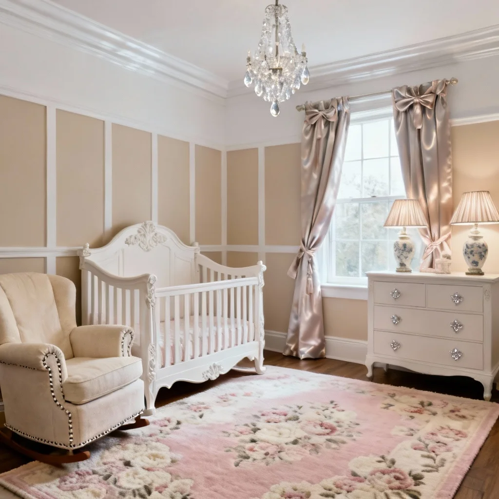
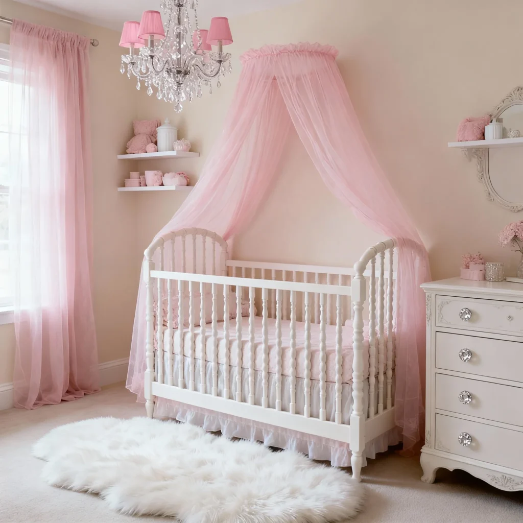
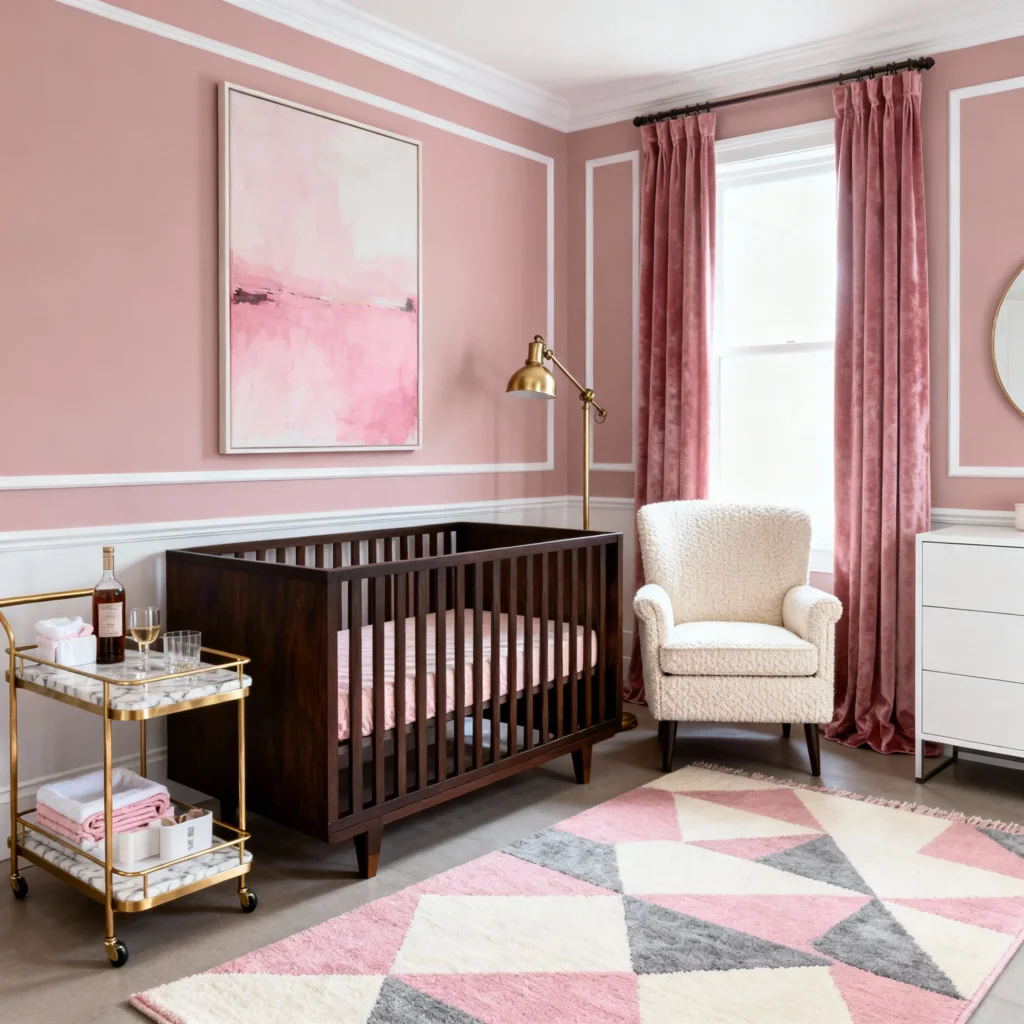
Beautiful Pink Nursery Paint Colors
Pink remains a classic choice for nurseries, but today’s pink palettes go far beyond bubblegum. These sophisticated, dusty pinks create elegant spaces that feel modern and timeless.
17. Sherwin Williams Malted Milk (SW 7554)
An incredibly soft, barely-there pink, Malted Milk adds a subtle feminine touch without overwhelming the space. This delicate shade works almost like a neutral, providing warmth and sweetness while maintaining versatility. It’s light enough to work in rooms with limited natural light.
Best for: Soft, feminine, and romantic nurseries
18. Farrow & Ball Sulking Room Pink (295)
This deeper, dusty pink makes a bold statement while remaining sophisticated and calming. Sulking Room Pink has a powdery, muted quality that prevents it from feeling too bright or juvenile. It creates stunning contrast when paired with white trim and works beautifully with both modern and traditional furniture.
Best for: Statement-making, sophisticated, and vintage-inspired nurseries
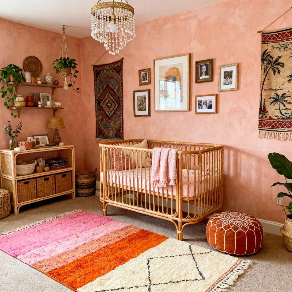
19. Farrow & Ball Setting Plaster (231)
With beautiful peachy undertones, Setting Plaster offers a unique twist on traditional pink. This warm, dusty rose creates an inviting, cozy atmosphere that feels both fresh and timeless. The color has enough complexity to create visual interest without being overwhelming.
Best for: Boho, eclectic, and warm, inviting spaces
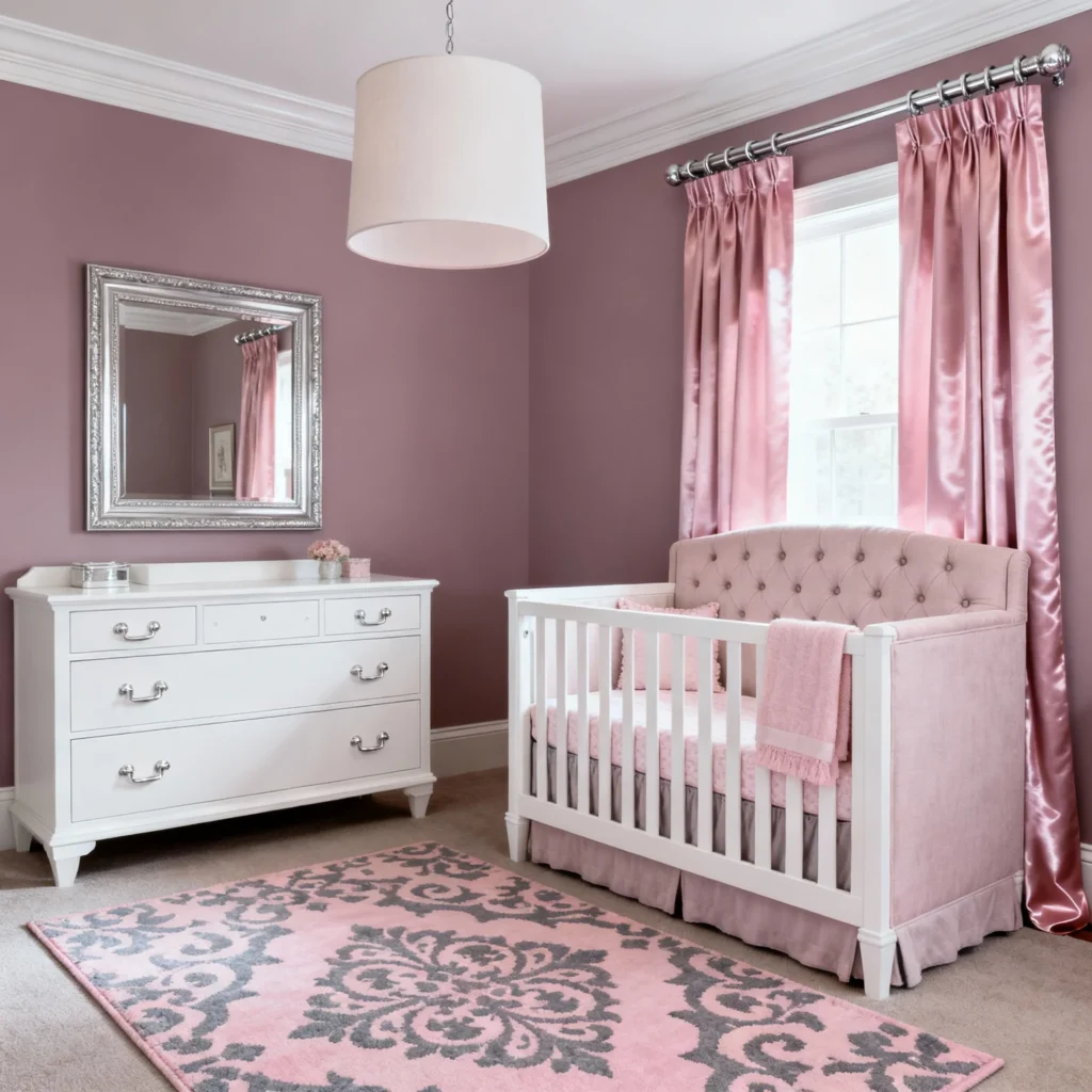
20. Benjamin Moore Pink Bliss (2093-70)
A soft, dusty mauve with gray undertones, this shade brings sophistication to pink nurseries. Pink Bliss changes with the light, appearing brighter during sunny days and deeper and more complex in softer lighting. It pairs beautifully with neutral palettes while adding a sweet, playful element.
Best for: Romantic, transitional, and classic nurseries
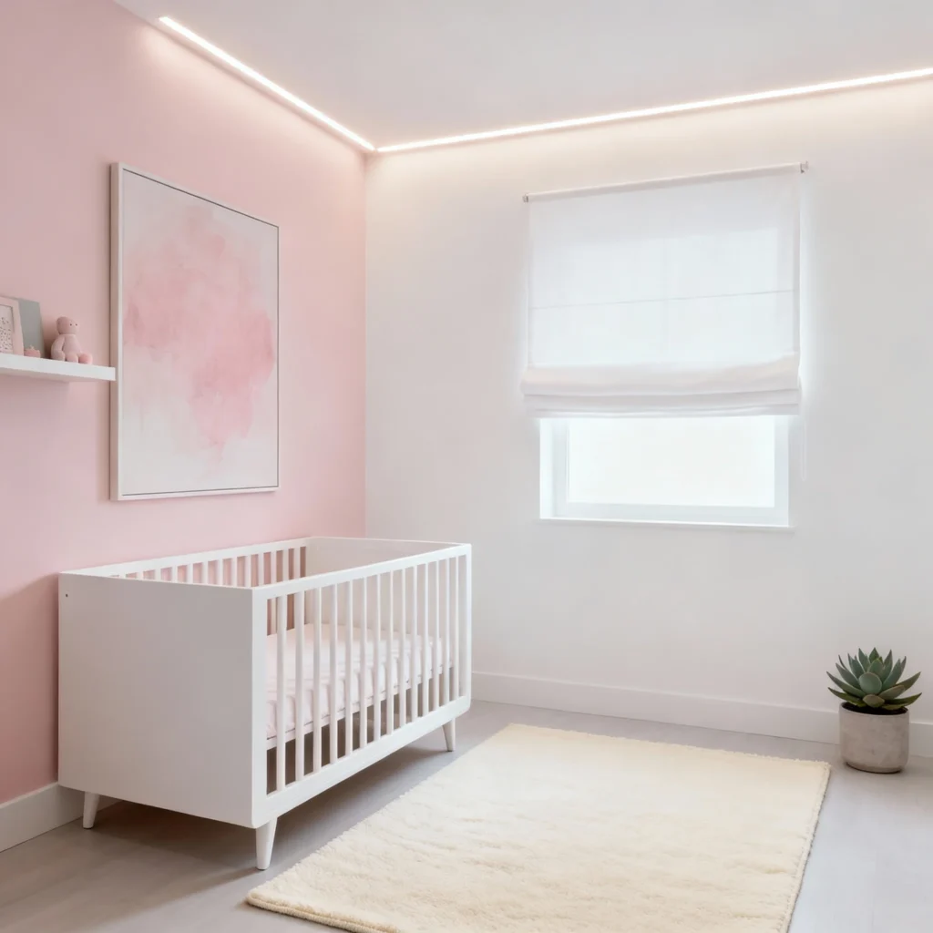
21. Sherwin Williams Innocence (SW 6302)
An extremely soft pink that almost reads as white with a blush tint, Innocence provides the perfect amount of color for those wanting subtlety. This barely-there pink creates a serene, peaceful environment and works beautifully with any accent color.
Best for: Minimalist, soft, and delicate designs
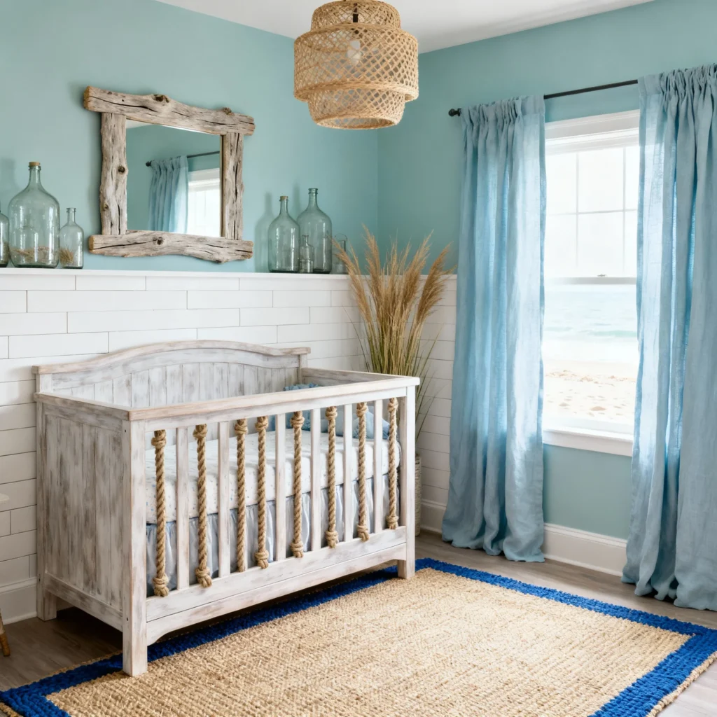
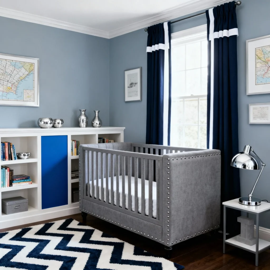
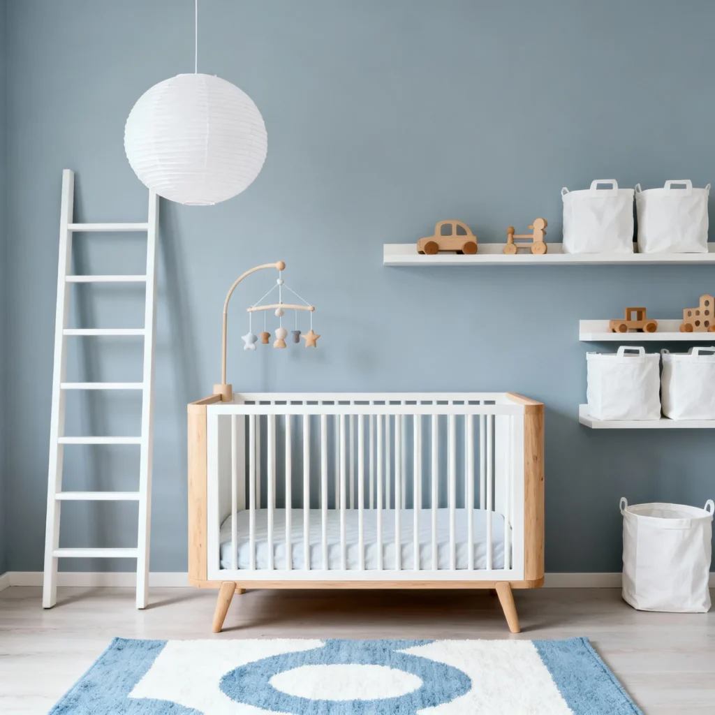
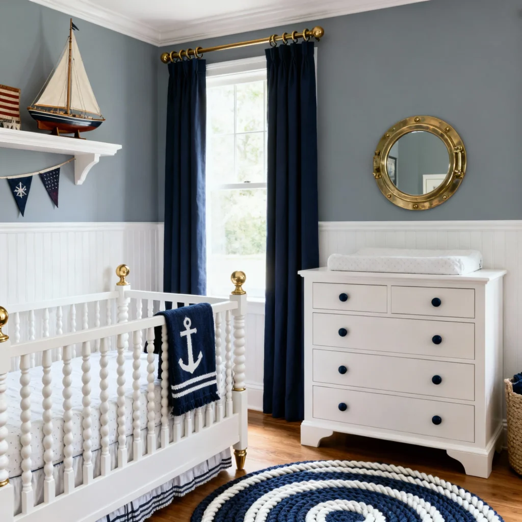
Calming Blue Nursery Paint Colors
Blue has long been associated with tranquility and calmness, making it a natural choice for nursery walls. These sophisticated blues go beyond traditional baby blue to offer unique, stylish options.
22. Benjamin Moore Palladian Blue (HC-144)
This soft, gray-blue with slight green undertones creates a peaceful, spa-like atmosphere. Palladian Blue works beautifully in both traditional and contemporary nurseries, and its complex undertones ensure it never feels flat or one-dimensional.
Best for: Coastal, transitional, and serene nurseries
23. Sherwin Williams Rain (SW 6219)
A medium-toned blue-gray, Rain brings the perfect amount of color without being too bold. This versatile shade creates a calming environment and pairs beautifully with white furniture and natural wood tones. The color has enough depth to feel intentional and designed.
Best for: Modern, sophisticated, and gender-neutral spaces
24. Behr Light French Gray (N480-2)
Despite its name, this is a beautiful soft blue-gray that creates an airy, open feeling. Light French Gray has cool undertones that work particularly well in sunny rooms, and it coordinates effortlessly with both warm and cool accent colors.
Best for: Light, airy, and Scandinavian-inspired nurseries
25. Benjamin Moore Wickham Gray (HC-171)
A true blue-gray, Wickham Gray offers more color saturation than typical gray-blues while maintaining a sophisticated, calming quality. This shade works beautifully as a full-room color or as an accent wall and pairs exceptionally well with white trim.
Best for: Traditional, coastal, and classic nurseries
How to Choose the Right Nursery Paint Color
With so many beautiful options, how do you narrow down your choice? Here are expert tips for selecting the perfect nursery paint color:
Consider the Room’s Natural Light
Rooms with abundant natural light can handle darker, richer colors without feeling closed in. North-facing rooms benefit from warmer paint colors, while south-facing rooms can accommodate cooler tones beautifully.
Think Long-Term
While you might be designing for a newborn, consider how the color will work as your child grows. Neutral and muted tones offer more flexibility for decor changes as your child’s personality and preferences develop.
Test Before Committing
Always test paint samples on your nursery walls before making a final decision. Paint large swatches (at least 2×2 feet) and observe them at different times of day to see how the color changes with the light.
Consider the Color’s Undertones
Every paint color has undertones—hints of other colors that affect how the shade appears. Understanding whether a color has warm (red, yellow, orange) or cool (blue, green, purple) undertones helps ensure it coordinates with your furniture and decor.
Factor in Your Decor and Furniture
Consider the colors of your crib, changing table, rug, and other nursery essentials. Choose a wall color that complements these pieces rather than competing with them.
Popular Nursery Paint Combinations
Can’t decide on just one color? These paint combination ideas create visual interest and dimension:
- Two-Tone Walls: Paint the bottom half of walls one color (often darker) and the top half another (often lighter) separated by trim or molding
- Accent Walls: Choose one focal wall (typically behind the crib) for a bolder color while keeping other walls neutral
- Board and Batten: Use two coordinating colors for board and batten or wainscoting treatments
- Ceiling Color: Don’t forget the fifth wall—painting the ceiling a soft color adds unexpected charm
Best Paint Finishes for Nurseries
Beyond color selection, the paint finish matters for both aesthetics and practicality:
- Eggshell: The most popular choice for nursery walls, offering a slight sheen that’s easy to clean while hiding minor imperfections
- Satin: Slightly more lustrous than eggshell, satin is very durable and washable—ideal for high-traffic areas
- Matte: Provides a sophisticated, flat finish but shows marks more easily
- Semi-Gloss: Best reserved for trim, doors, and cabinets due to its high sheen and exceptional durability
Non-Toxic Paint Options for Baby Rooms
Safety is paramount in a nursery. Look for paints with these certifications:
- Zero-VOC or Low-VOC: Volatile organic compounds can off-gas harmful fumes
- Greenguard Gold Certified: Tests for over 10,000 chemicals and VOCs
- Green Seal Certified: Environmental and health standards certification
Popular non-toxic paint brands include Benjamin Moore Natura, Sherwin Williams Harmony, and Farrow & Ball (which uses water-based formulations).
Final Thoughts on Choosing Nursery Paint Colors
Selecting a nursery paint color is an exciting step in preparing for your baby’s arrival. Whether you choose a trending green, a timeless neutral, or a soft pastel, the most important factor is that you love the color and feel it creates the right atmosphere for your family.
Remember, there’s no wrong choice—trust your instincts and select a color that brings you joy every time you walk into the room. After all, you’ll be spending countless hours in this space, and it should feel like a sanctuary for both you and your little one.
The colors featured in this guide have proven popular for good reason: they’re beautiful, versatile, and create the calming environments babies need and parents appreciate. Use this as your starting point, test your favorites, and create a nursery you’ll treasure for years to come.
Ready to start your nursery painting project? Pin your favorite colors from this guide and order those paint samples—your dream nursery is just a few coats away!